
A project with the National Institute of Design (NID)
Project guide: Tarun Deep Girdher
Produced at the Print Labs, NID
Every year the National Institute of Design distributes diaries to all their staff members, faculty and students.As part of my final classroom project I re-designed the diary for 2015 and for the years to come.
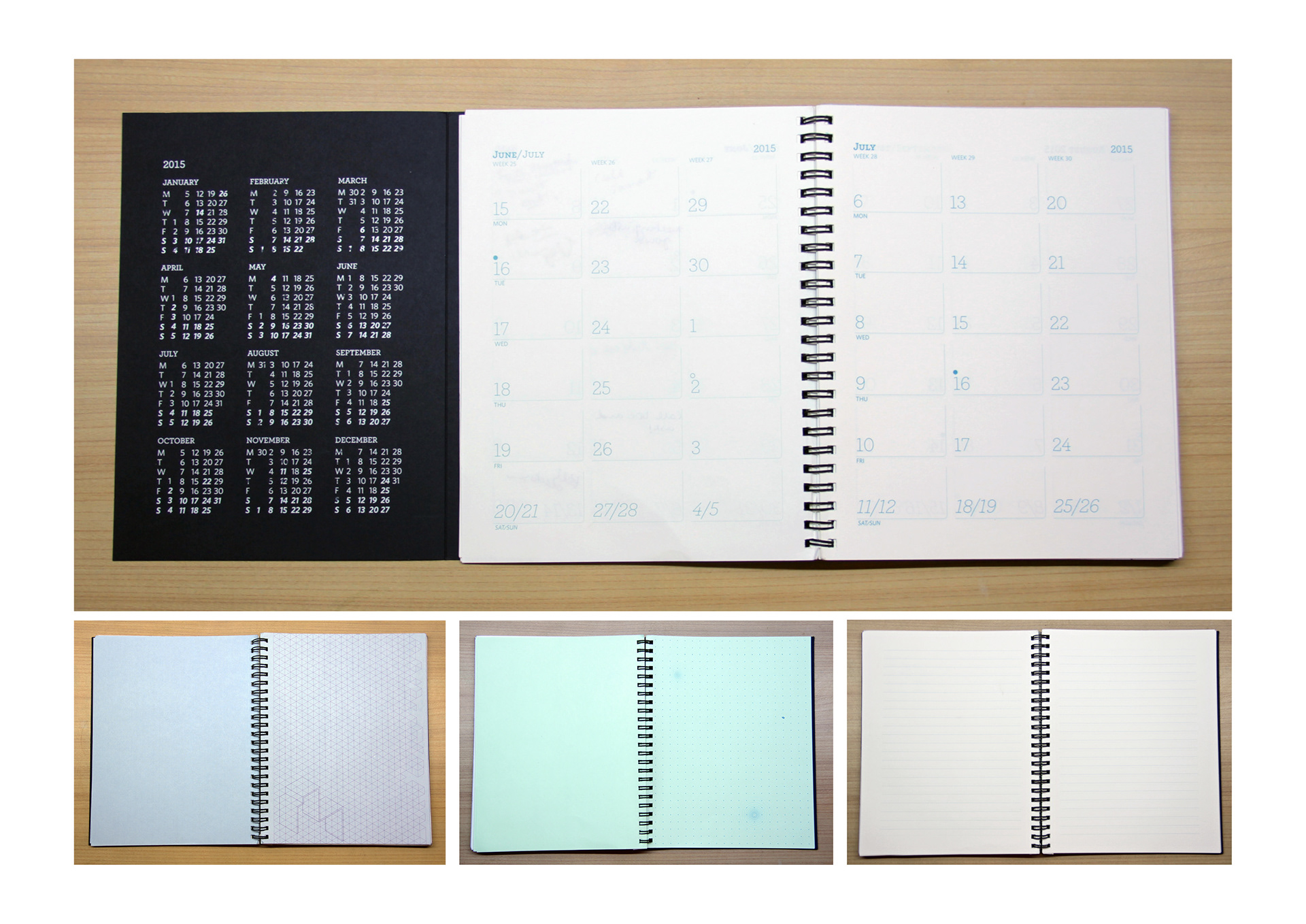
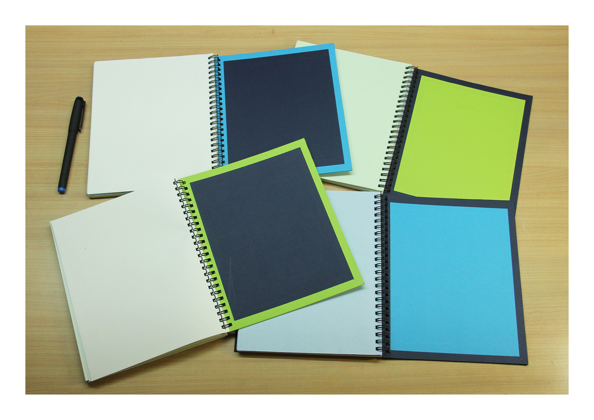
The diary has two versions, one for the staff and faculty and another for the students. The dark blue is for the staff and faculty and the bright green and light blue is for the students. Both versions include a planner and the NID directory. The inside pages don’t have any dates, but include various types of grids.
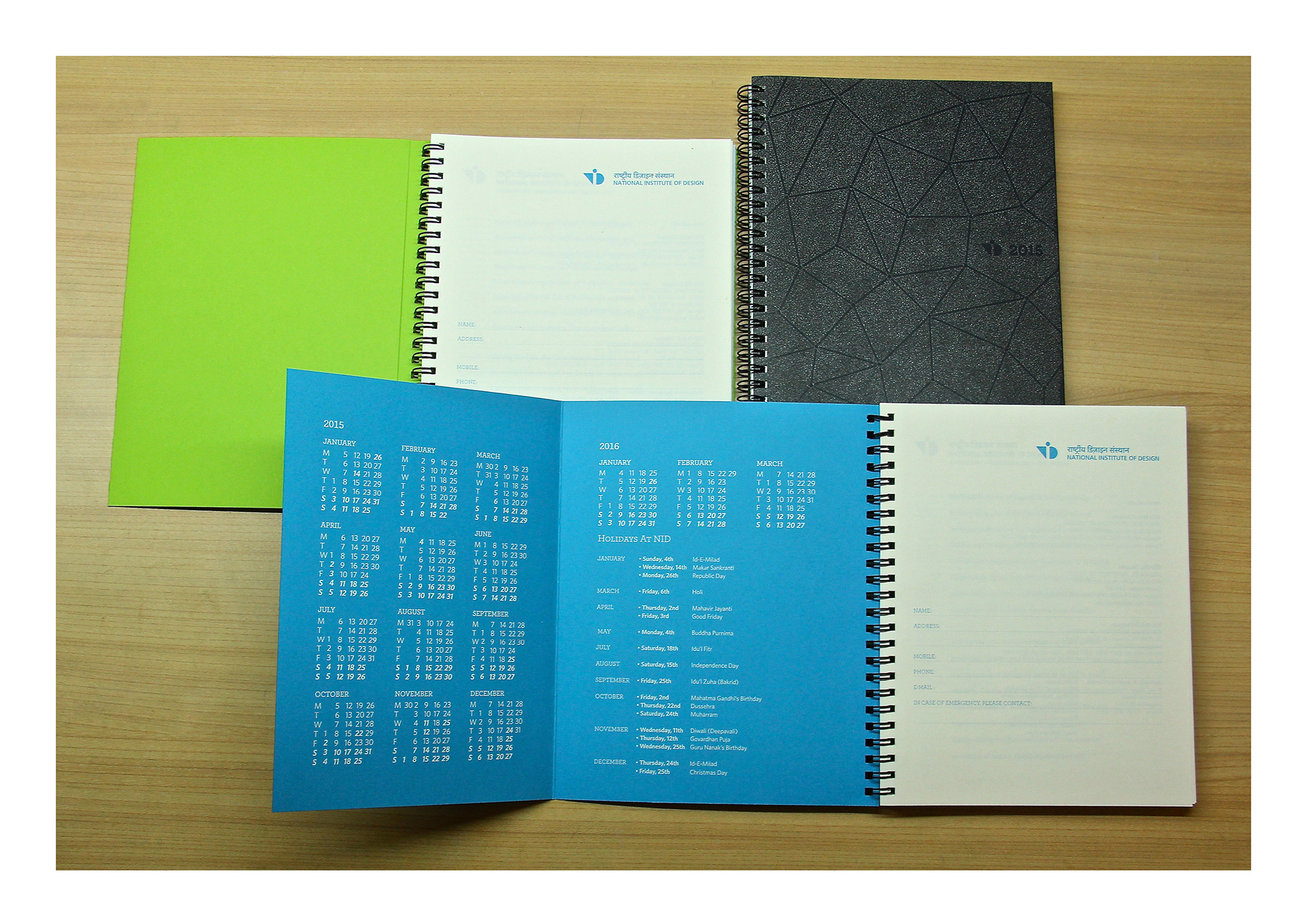
The cover is printed using transparent UV bubble ink. This creates a tactile and playful texture. The inside cover is gate folded and has an easily accessible calendar and the list of holidays at NID. The gate folded cover can also work as a book mark for the planner.
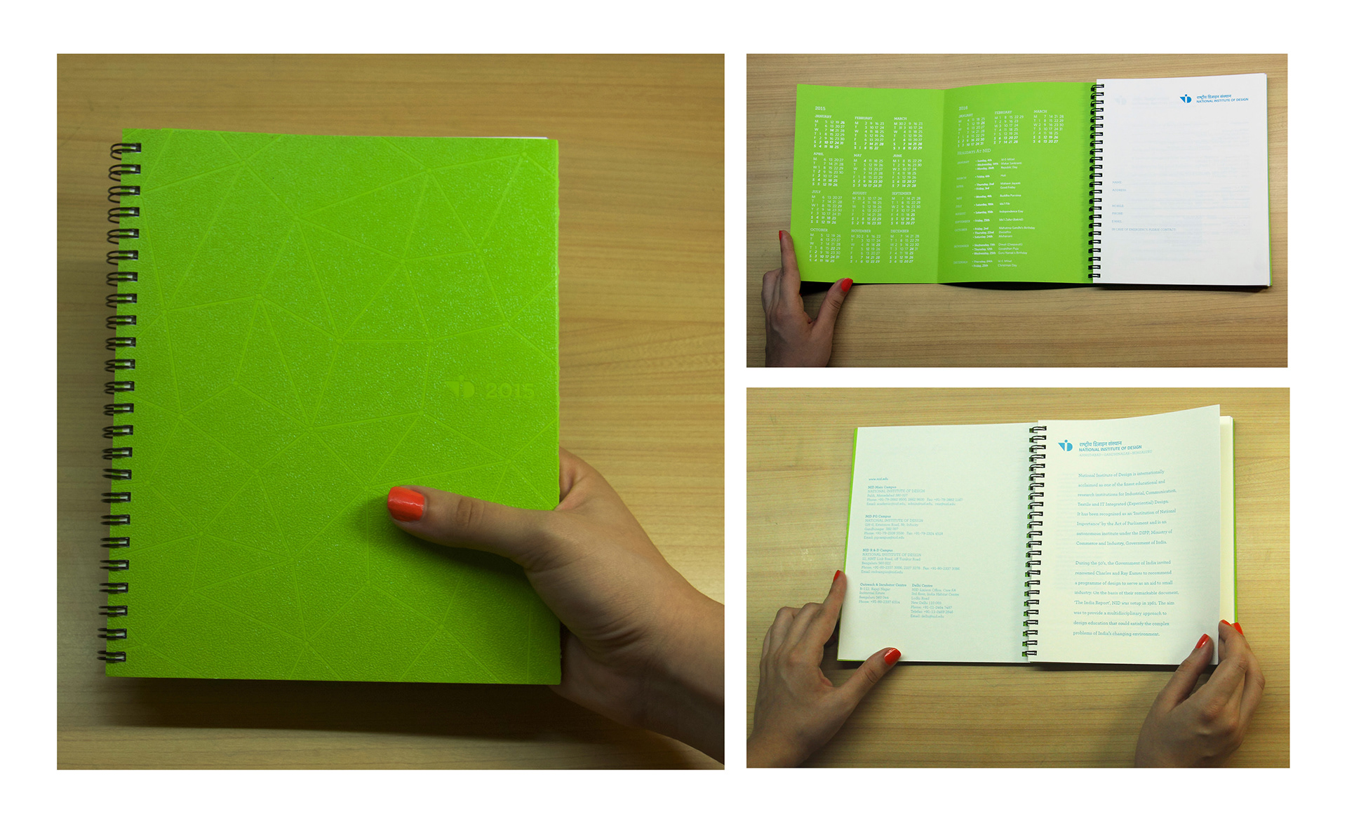
This is the bright green student edition.
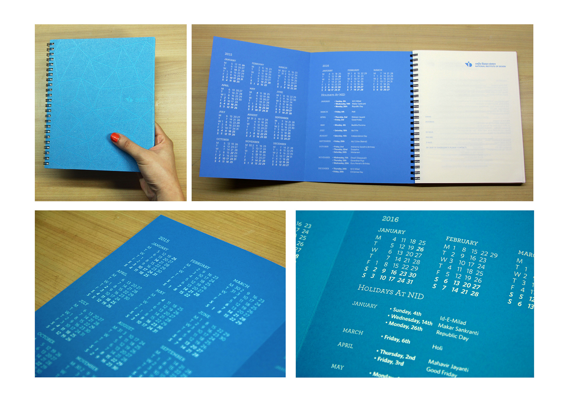
This is the light blue student edition.
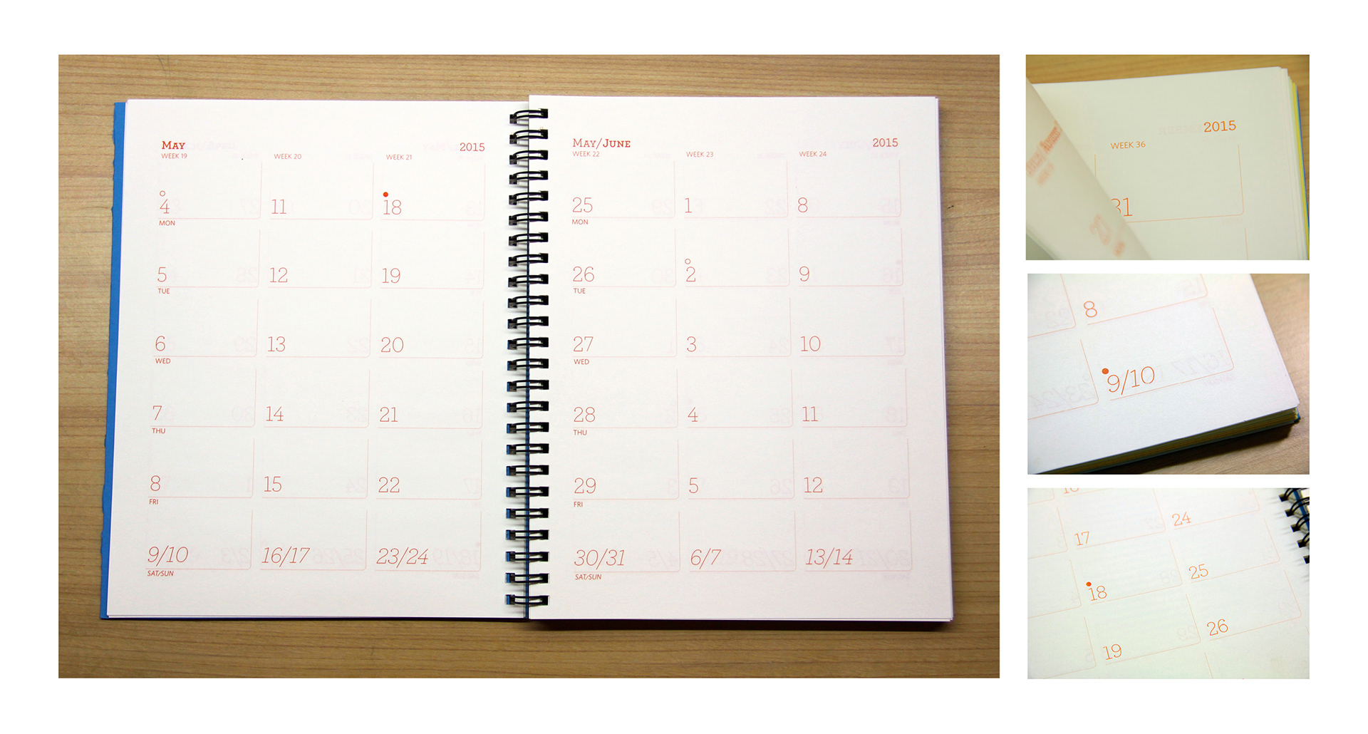
These are the planner pages. The moon cycle has been marked in this section. The new moon is marked with a filled-in circle and the full moon by the ring above the date.
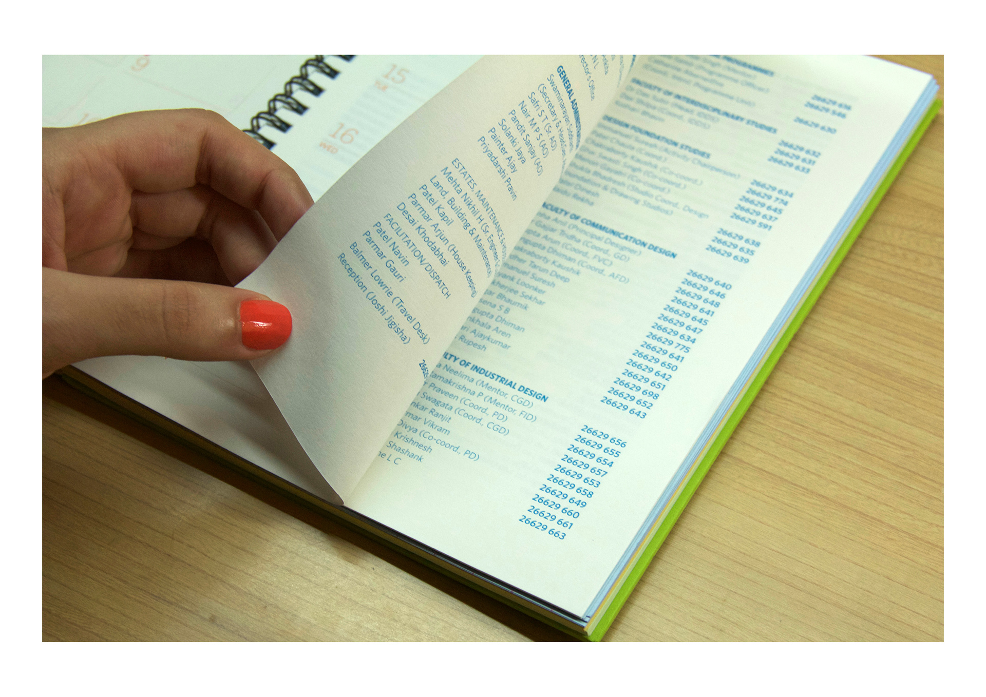
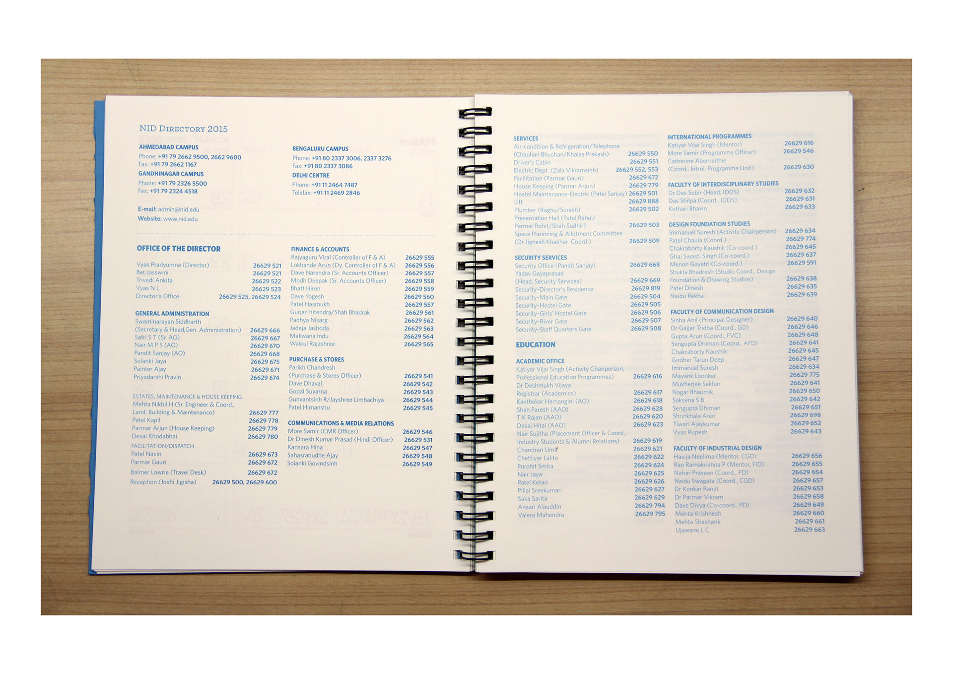
The planner is followed by the NID Directory.
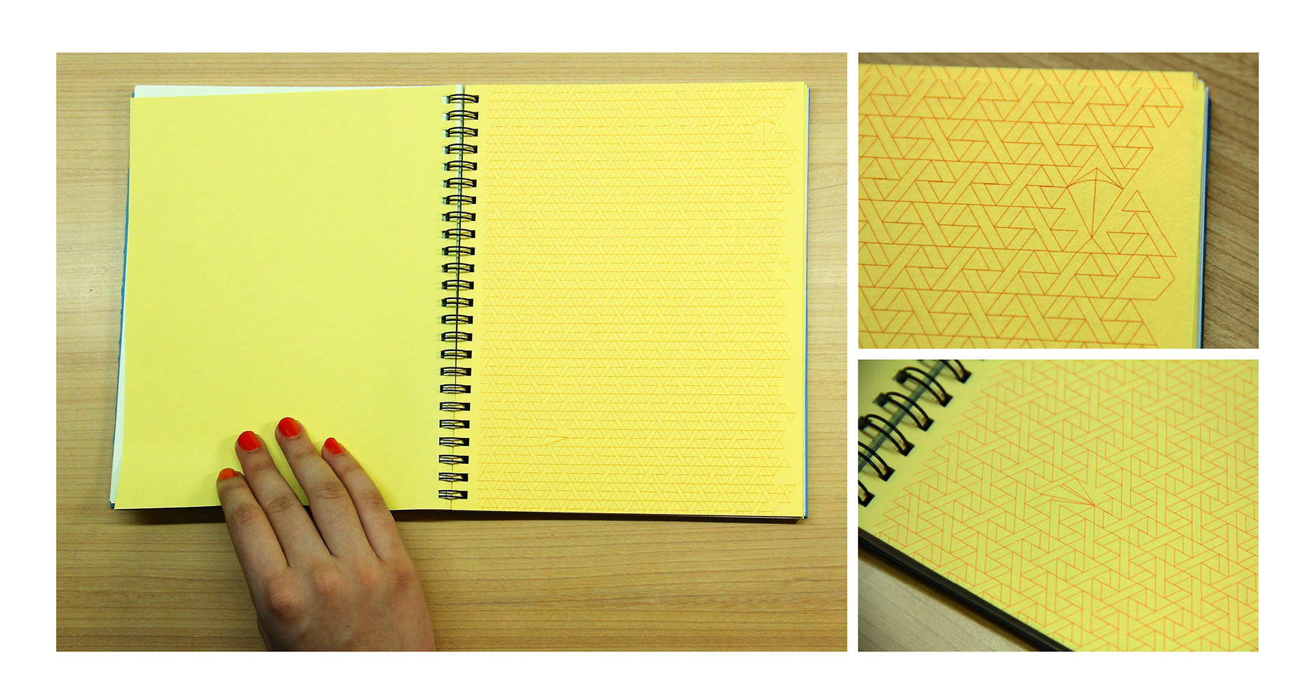
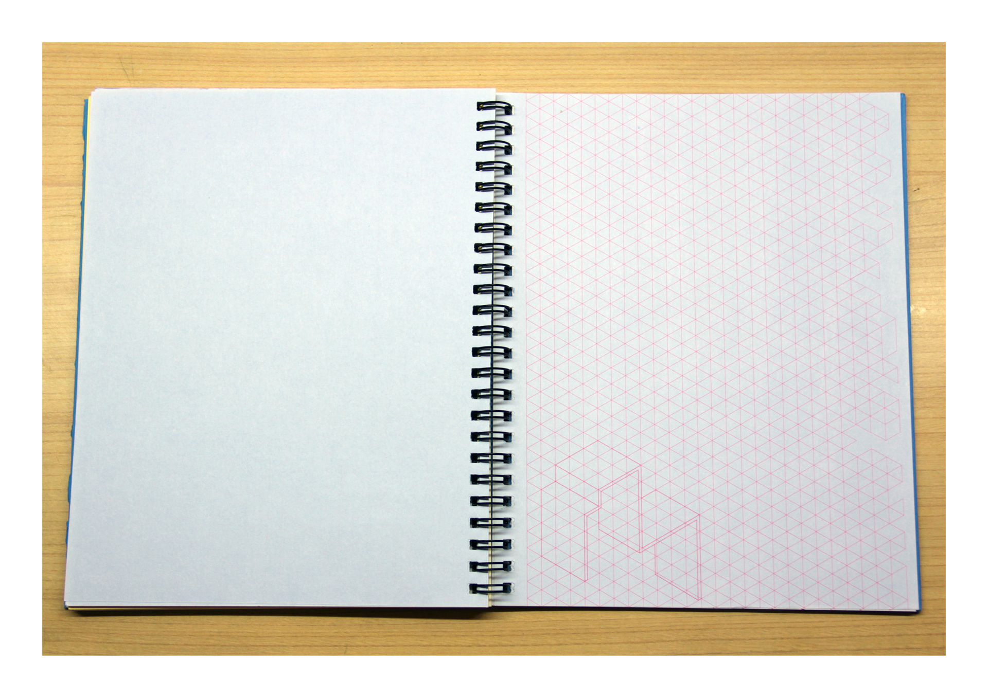
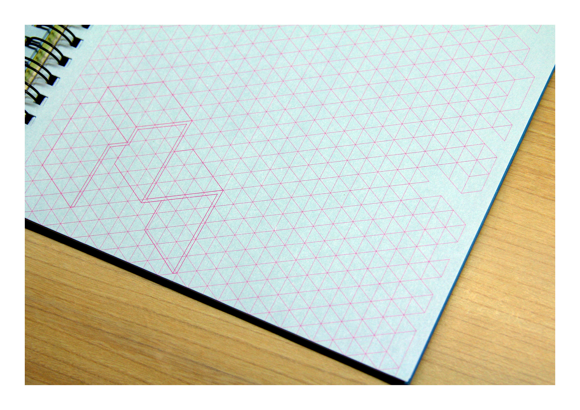
This is a special grid that I created for the diary, using triangles. This is only in the student edition.
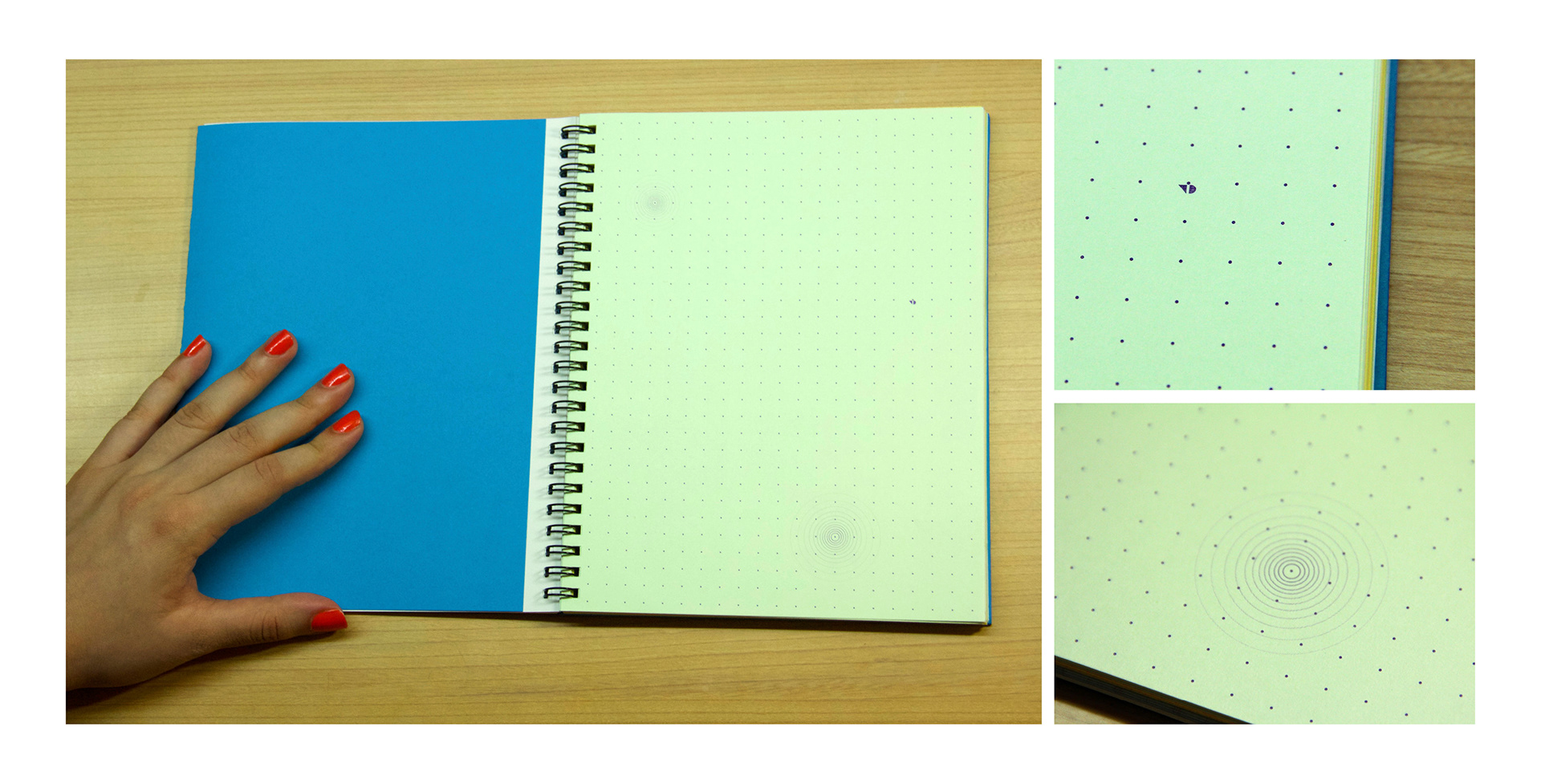
This is the dotted grid into which the NID symbol has been incorporated.
This is the isometric grid, which is found in both editions.
This is the staff and faculty edition. This one has ruled pages unlike the student edition. This one has a more serious approach. It uses a more mature colour scheme, and can be used as a more traditional diary.
The back inside cover of the diaries uses various colour combinations.
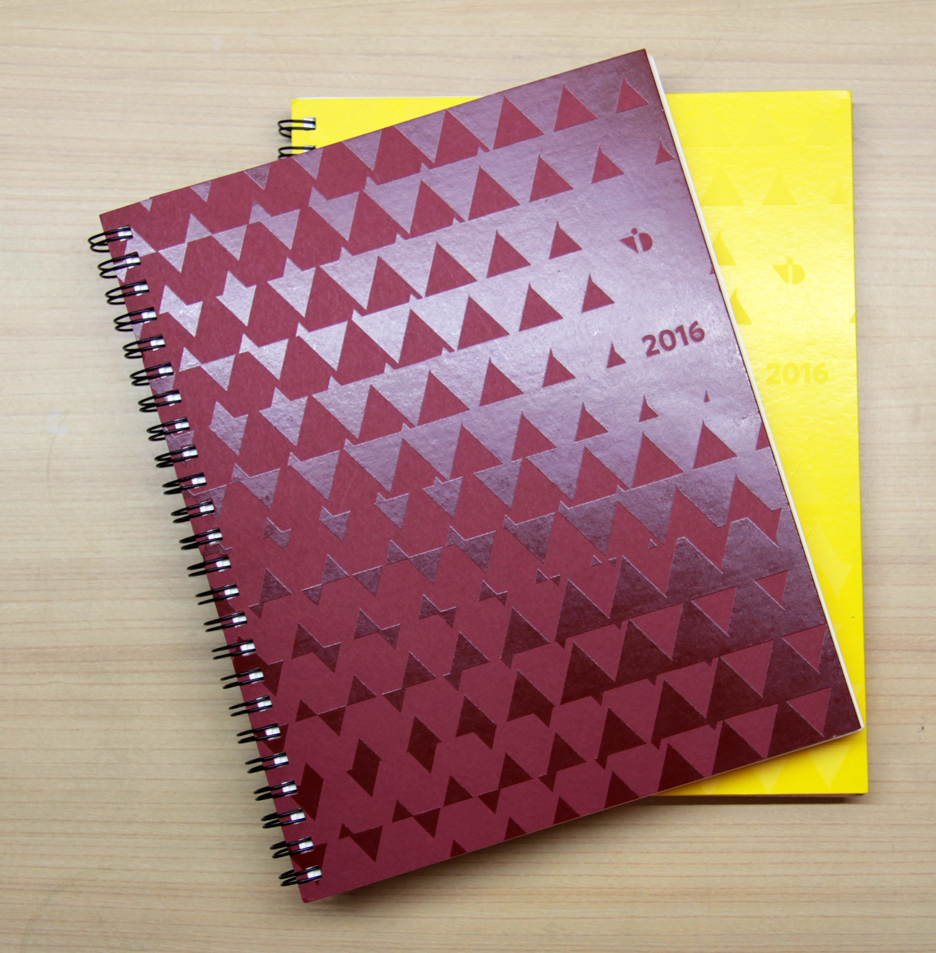
This is a sneak peak of the 2016 edition of the diary. This cover is not designed by me, but the inside pages are.
The 2016 edition also has some different papers. The student editions are in yellow and orange, while the staff and faculty edition is in maroon.